One of the insights I took away from the recent MLA conference was the sheer difficulty both of communicating complicated information in a short amount of time when I went to panels, as well as the impossibility of absorbing such an overwhelming volume of information. A key tool that I felt was underutilized during the conference are graphics that could concisely communicate information relevant to literary study.
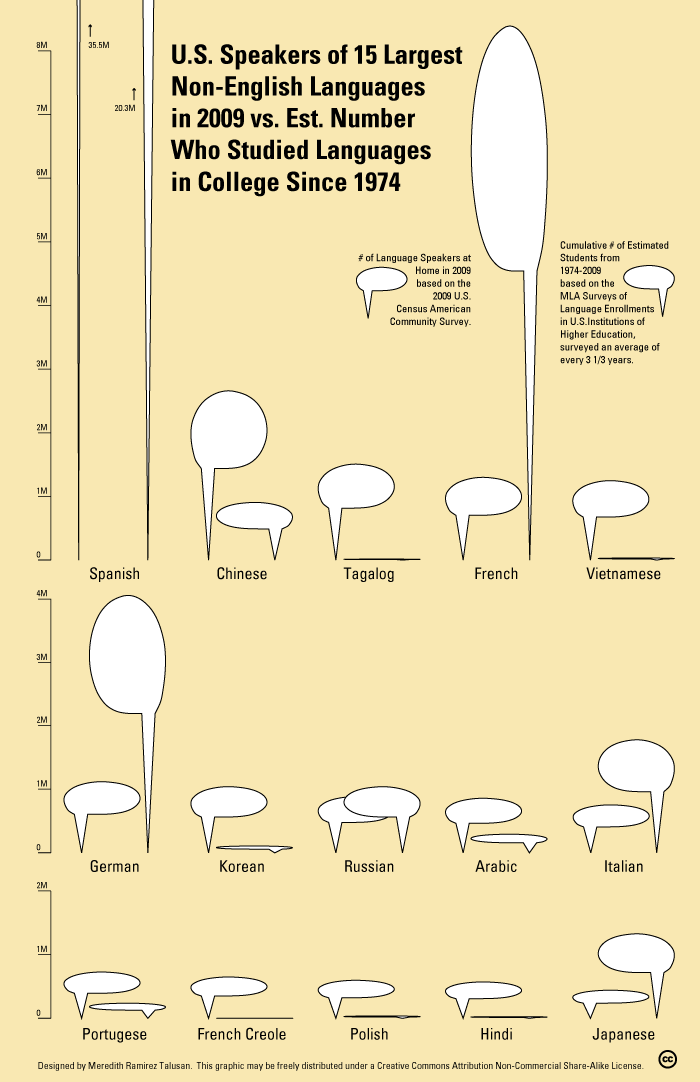
So I’ve decided to start what I hope to be a series of visualizations that attempt to effectively illustrate important issues related to literature. When I attended the MLA panel entitled Comparing Modern Literatures Worldwide: Can It Be Done within the Current MLA Structure?, I heard Françoise Lionnet discuss the relationship between teaching literatures in different languages with the increasingly multilingual makeup of the United States. This relationship is vital but I believe has not been sufficiently emphasized, given that arguments for language teaching in the U.S. tend to focus more on their relevance in an international context rather than in understanding those within the country's borders. So I decided to compile and design this visualization, which compares the latest 2009 U.S. census data regarding languages spoken at home with statistics from the MLA Language Enrollment Database. Notes regarding my methodology and conclusions follow the graphic:

While the data from the U.S. census is relatively transparent (except for the separation of French Creole from French but not from Spanish or Portugese), I had a harder time getting accurate data about language enrollment and study in U.S. higher education institutions. It seems that the MLA conducted enrollment surveys at irregular intervals, and the datasets don't specify the level at which students are enrolled. I chose to make an estimate of the total the number of enrollees from 1974-2009 by using the survey numbers, and using the average of the prior and following survey year for years in which no surveys were conducted. Even though the survey data begins in 1958, I started at 1974 because data from before that year is incomplete, with many languages excluded from the surveys.
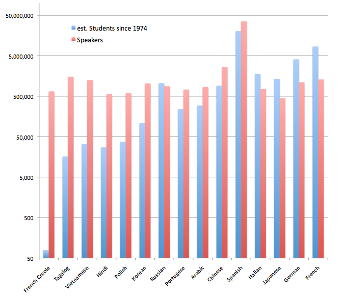
Even though I was aware that European languages are taught a lot more than non-European ones, I was not aware of the extent of this gap, especially in relation to the number of speakers of certain languages in the U.S. While Tagalog is the 4th most spoken language in the U.S. and Vietnamese the 6th, only 1 person has studied Tagalog in college for every 94 people who speak in the U.S., and the corresponding ratio for Vietnamese is a slightly better 1 in 38. In contrast, there are an estimated 13 people in the U.S. who have studied French in college for every 2 people who speak it at home. And while the ratio of Tagalog to French speakers is almost 1 to 1, an estimated 555 people have studied French in college since 1974 for every 1 person who has studied Tagalog.
The graphic also gave me a clearer sense of the scale of Spanish language use in the U.S., both in terms of speakers and students. I also learned that Japanese is the only non-European language in my estimate that has had more students than speakers in the U.S. Chinese and Arabic may catch up eventually, but not anytime soon. And of course, every graphic omits useful information, such as the relationship between these languages and English, as well as the changes in enrollment numbers for different languages over time. I may at some point return to these questions in a separate graphic. In the meantime, I've become much more curious about studying Vietnamese once my dissertation is done.
EDIT 1/26: Since this post first appeared a number of people have made suggestions about how to improve the design of the graphic. While I feel like it's outside the scope of Arcade to discuss infographic design extensively, though some of the issues do overlap with humanist concerns such as the status of objectivity in these graphs, I wanted to post an alternate graphic that presents the same data by Colin Lieberman (thanks Colin), using the more standard columns to represent values and a logarithmic scale that increases by order of magnitude:


